HOLLAND
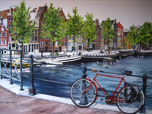
For some reason, this image was incredibly hard to draw. I struggled with the proportions of the bike, and as I don't use any type of technology to transfer and draw my initial images, I remember a lot of erasing and frustration until I was satisfied. The bike, although it doesn't take a lot of physical space in the composition is the focal point and deserved to painted a brilliant red. I love how simple the idea of this image is... one bike leaning on a railing. In reality, this image is very complex to paint and took endless enjoyable hours of my life! The buildings, boats, and trees, with their repetition of shapes and small details help to balance the simplicity of the water. The zig-zag direction of the composition helps to keep your eye in the painting, and the red of the bike adds warmth to an otherwise cool palette.
